Hi! I'm Yachin. Designer for
digital brand
& experience

Hey! What are you working on? Let's collaborate and make something super cool!
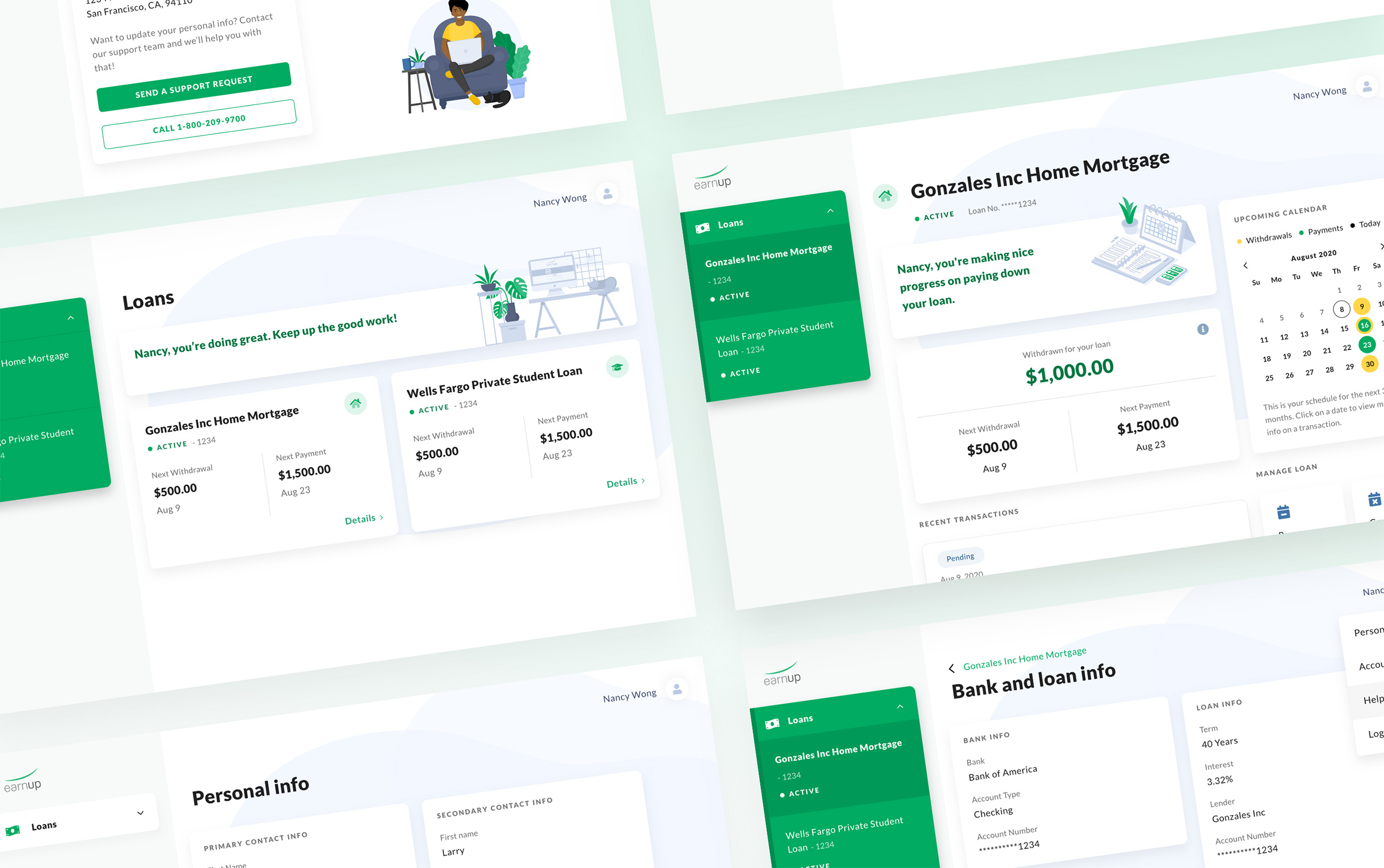
EarnUp
Bringing emotional support and ease of use into financial services
Levi's Global E-Commerce
Helping customers around the world purchase their favorite jeans online

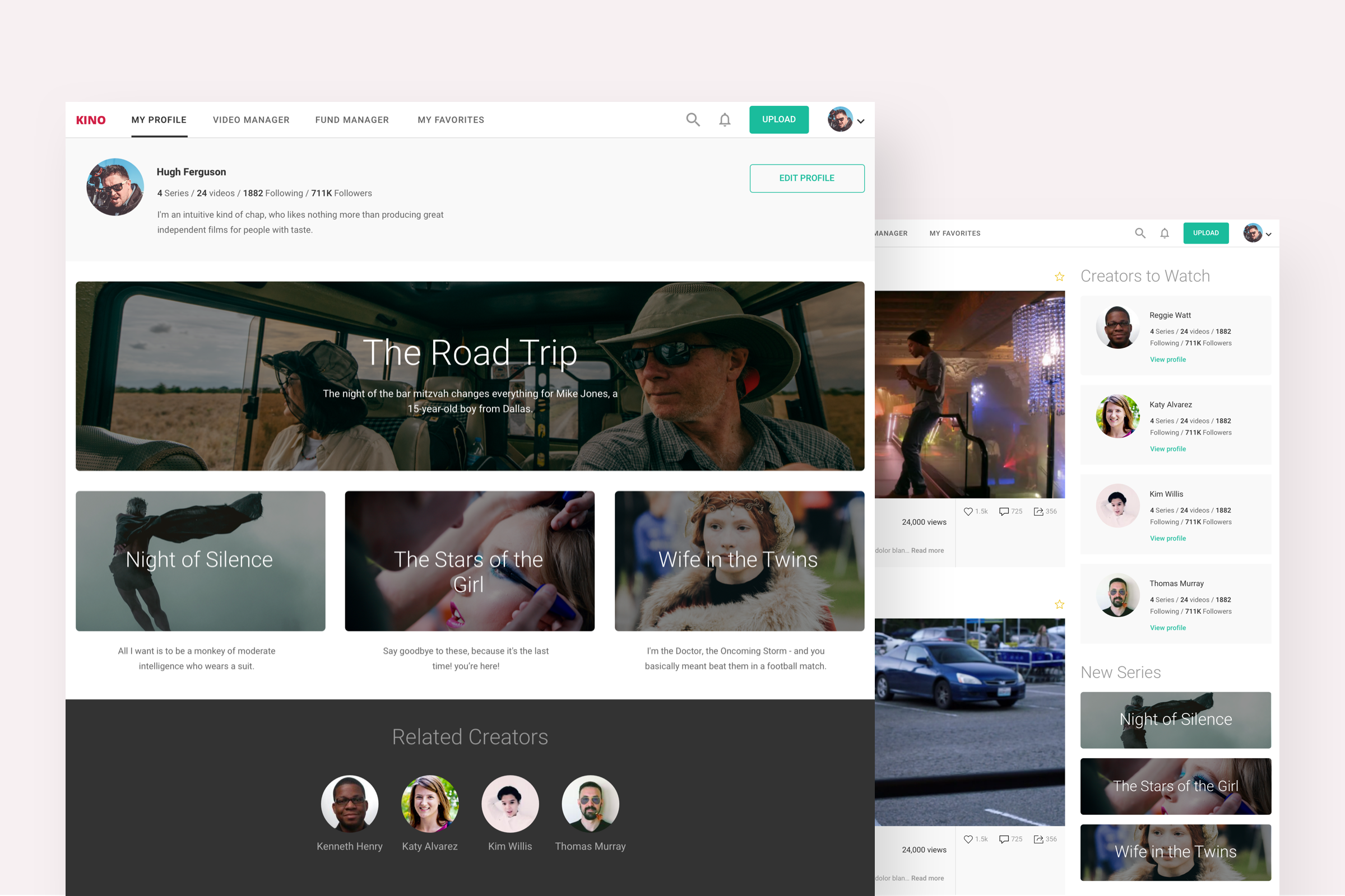
Kino
A social and investment marketplace for independent TV series
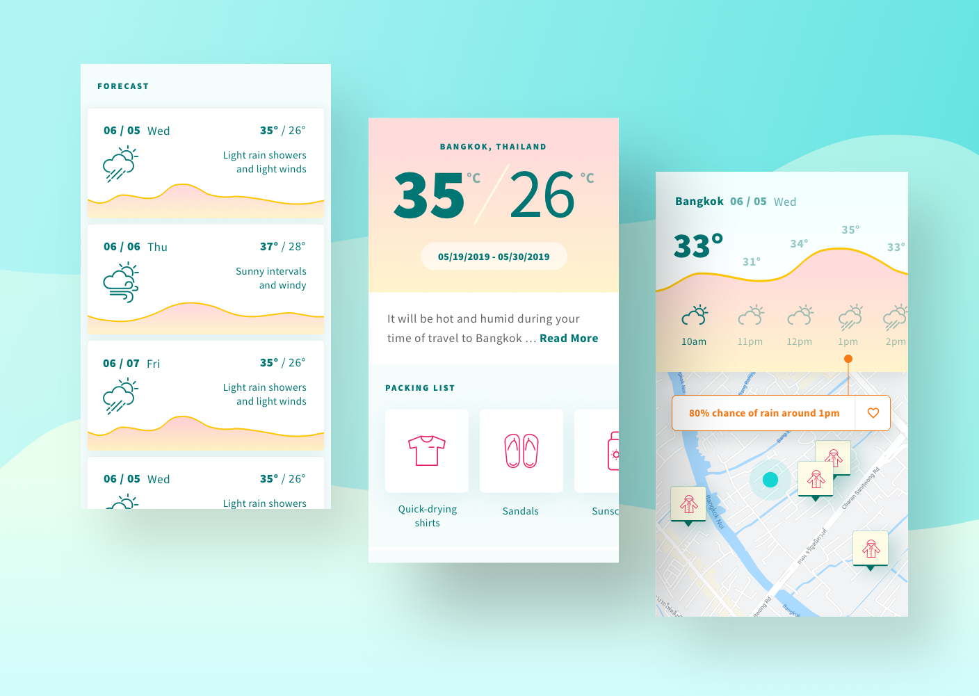
Sandals! Travel Weather App
Enjoy any weather on your dream vacation
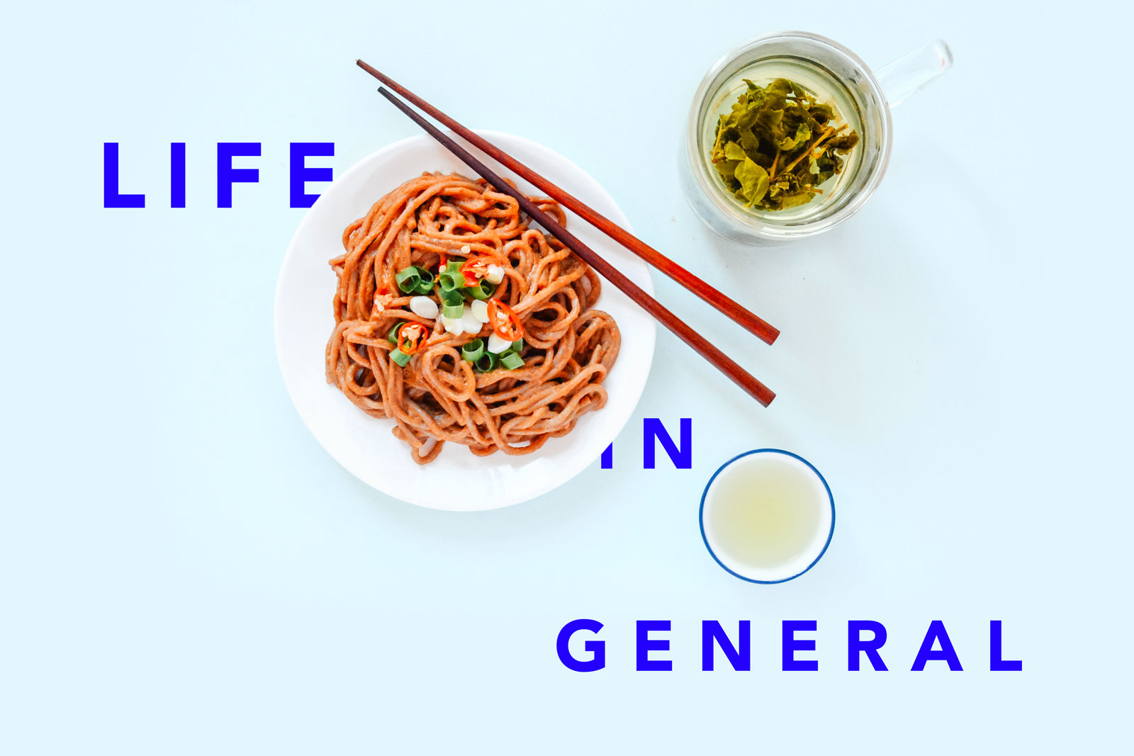
The Blog
Check out the blog in here where I share thoughts on design and life in general.